
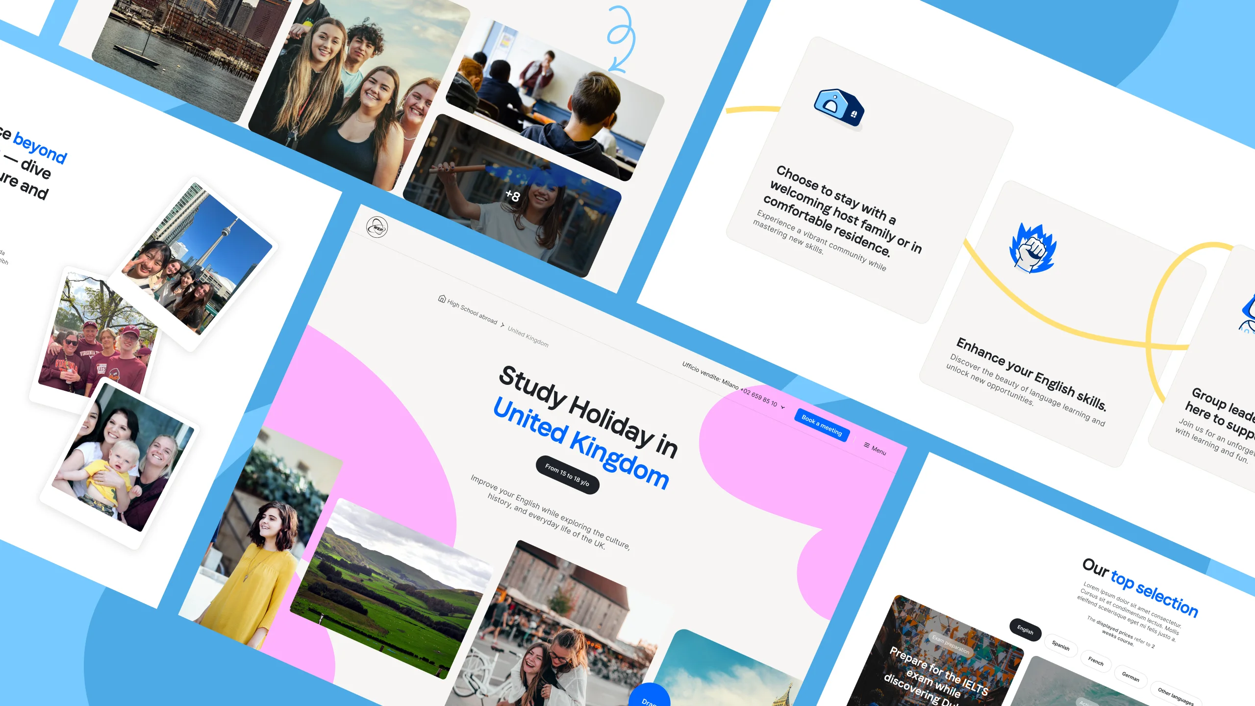
Rather than a one-off redesign, the work was an ongoing process of evolving WEP’s digital experience as new needs and opportunities emerged.
Introduction
WEP is an international organization specializing in school
programs and language courses abroad, alongside group study
trips and solidarity travel.
As its offering continued to expand, the website needed to
evolve alongside it, introducing new programs while making
existing journeys clearer and more effective.
Project Output
The work started with a broader redesign of WEP’s website,
creating a new foundation for the digital experience.
From there, I expanded and evolved this foundation as new
programs, requirements and opportunities emerged.
The result was a more consistent and adaptable website, able to
accommodate new programs while improving existing user journeys
and interactions.
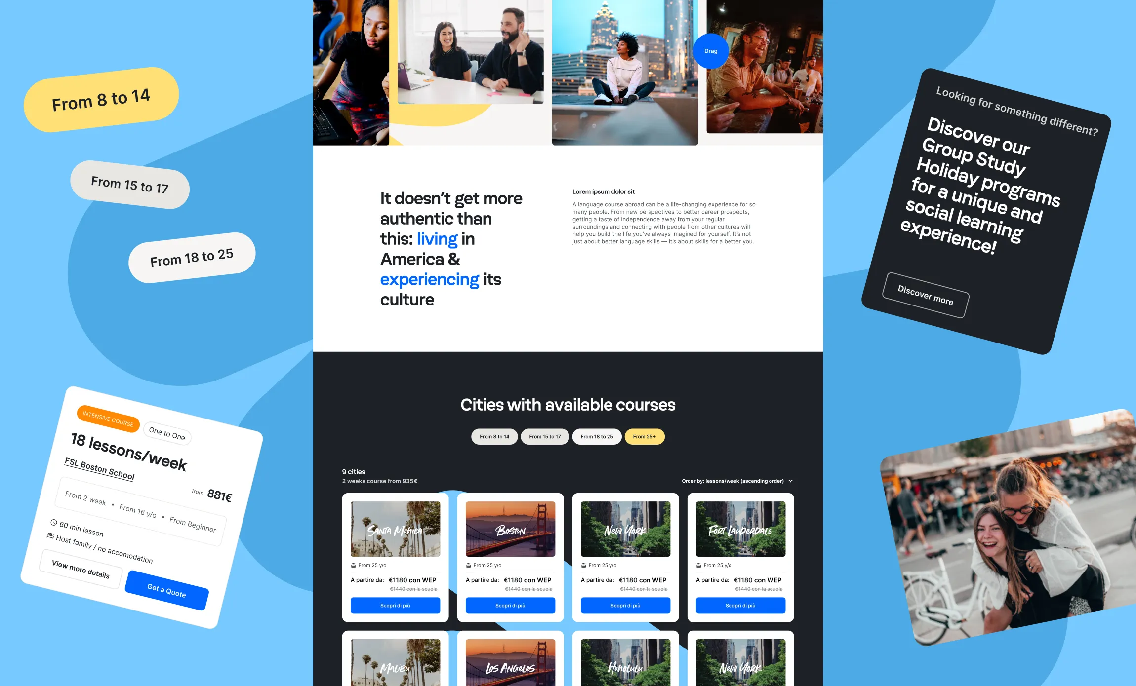
My role
My role focused on turning new business needs and user insights
into concrete improvements to the digital experience.
I designed new flows for emerging programs, such as Solidarity
Travel, working on their structure, interactions and content
hierarchy. I also tested these experiences with users to
identify friction points and validate design decisions before
implementation.
Alongside new features, I worked on smaller but highly impactful
areas of the website, identifying opportunities to improve key
moments in the user journey.
Every new program required a journey of its own, from understanding the offering to creating a clear path towards action.
Designing new journeys
As WEP expanded its offering, new programs required new digital
journeys, but also new ways of fitting them into the existing
experience.
I worked on translating these new business initiatives into
clear and intuitive user flows, while defining where they should
live within the existing information architecture and how users
could discover and access them.
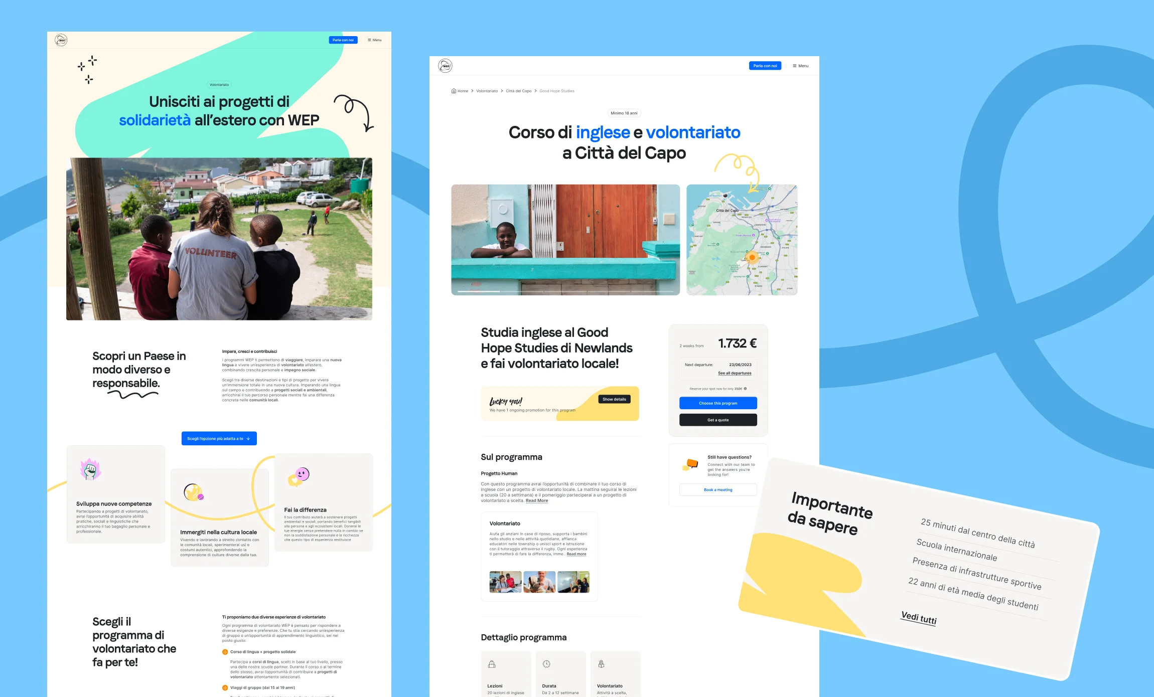
One example was Solidarity Travel, a program aimed at younger
travelers interested in combining international experiences with
social and cultural impact. A key challenge was to make the new
journey feel consistent with WEP’s existing design language and
component library, while giving it enough visual and structural
distinction to communicate the specific nature of the program.
This meant balancing consistency and differentiation across the
experience: reusing established patterns where they helped users
navigate confidently, while introducing new structures and
interactions where the program required a different approach.
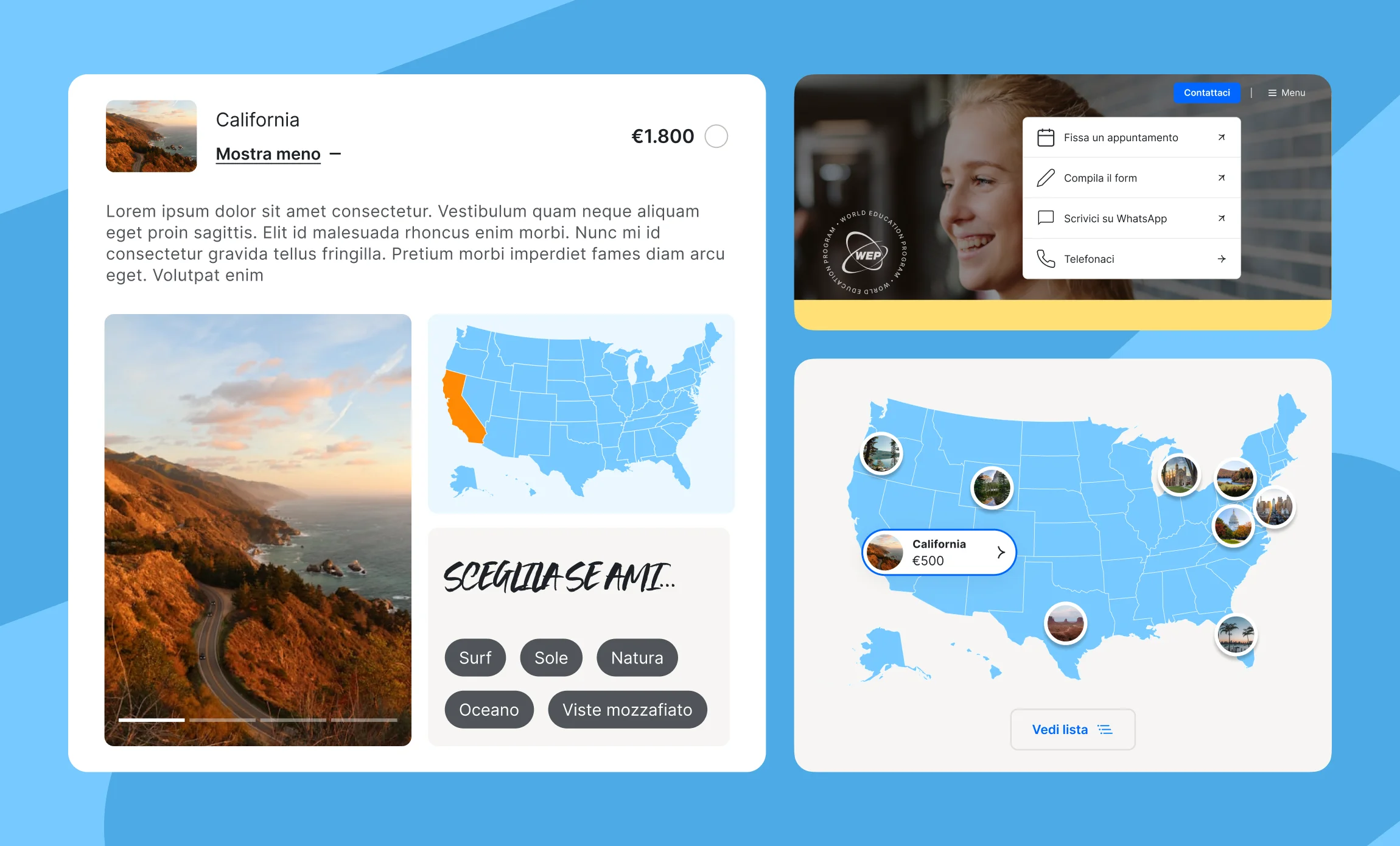
Alongside designing new journeys, I refined the website at a more granular level, improving information hierarchy, module structure and key interactions across different touchpoints.
Small changes, meaningful impact
Not every improvement required designing an entire journey. Some
of the most valuable opportunities came from refining individual
sections and modules across the website, making key information
easier to discover and actions easier to complete.
I worked on a range of these touchpoints, including interactive
maps to help users explore where courses were available, student
testimonial modules to bring real experiences into the journey,
and quick-access elements for checking prices and requesting a
quote.
I also improved the visibility and interaction of WEP’s
different contact options, making it easier for users to choose
how they wanted to get in touch.
These were relatively focused changes, but each one contributed
to making the overall experience clearer, more useful and more
effective.
Whether refining an existing experience or designing a new journey, user feedback helped uncover friction and validate solutions, extending the same approach to internal flows designed to simplify WEP employees’ daily work.
Validating the experience
Design decisions were not based only on assumptions. I tested
key customer-facing flows with users to understand how people
navigated the experience, where they encountered friction and
whether the information provided was enough to move forward.
User testing was also applied to internal flows designed for
WEP’s own platforms. In these cases, the goal was not only to
make the experience clear and efficient for the end user, but
also to simplify the work of WEP employees managing these
processes behind the scenes.
The insights gathered through testing were then translated into
concrete design iterations, helping refine both the structure
and interaction of the flows before implementation.